 We started a new project this week with a familiar client. One of the first things we do is to set the specifications formatting instructions for the entire team. Since it was a repeat client, we copied the previous format, updated the project information, and sent it for review. The response was a surprise.
Can We Reduce the Volume?
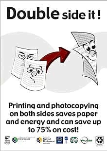
The last specification, our client lamented, required several volumes to bind the documents into manageable sizes. "Can we reduce the font size and use duplex printing to reduce the paper volume?" he asked. Considering that nearly every client has a unique spec format, we said, "Sure we can."
So off we went to create a custom template to format all the specifications for this next project. Reduce the font size 25% from 12 point to 9 point. Change the page set up to duplex (double sided) printing. But the client asked that headers and footers be mirrored for odd and even pages. Not a problem since it only requires a few more lines of macro code.
Oh, and every section must be an even number of pages so each spec section always starts on the right-hand page. Again not a problem. We have a macro to automatically insert blank pages (no header and footer). We make the page truly blank - never inserting the text "This Page is Intentionally Blank." Is this really required? If it's blank it's blank. For specifications, when you see "End of Section" as the last line of the each section, you have the entire document.
Is Readability Sacrificed?
Font size, line height, and line width are all interrelated. Ideally, all three must be balanced for optimal readability. Changing any one of the attributes requires a change in the other attributes as well to maintain the proportions and the readability factor.
Specifications (at least good ones) do not consist of pages of dense text composed with lengthy paragraphs. So cramming more characters on a line will not reduce the volume as much as it may seem. Many specification paragraphs are single lines and paragraphs, if well written, have fewer than 6 lines of text - ideally 2 or 3 lines. Reducing the paragraph spacing will help somewhat, but white space helps readability.
It's a balance, so be careful the reduced font size does not hinder readability. Remember some folks involved in construction, including me, are battling maturing eyesight - making reading small font sizes increasingly difficult. Bifocals and magnifying glasses may be common, and necessary, tools.
What of the Format?
The header and footers are mirrored. The client likes to have text at the unbound margin in the header and at both margins the footer. CSI PageFormat recommends the most important information belongs at the unbound margin. This includes the section title, section number, and page number. Keeping important navigational information at the unbound margin makes sense for printed material. CSI also recommends no more than 3 lines of text for headers and footers.
If specifications are distributed electronically and viewed on-screen, an unbound margin no longer exists. Navigation by flipping pages is replaced by electronic bookmarks. Mirrored header and footer data become distracting when scrolling through an electronic document.
Consider limiting the header and footer information and centering the data on the page. This approach will work for simplex and duplex printing and will work well for on screen viewing.
So What Did We Save?
The existing voluminous spec book was 1557 pages, simplex (single sided) printed. Using 20 lb paper, this produces a stack approximately 6.25 inches high - too large for two 3 inch binders.
As an experiment, I tried making the adjustments on the client's voluminous project. Here is the statistical comparison as published and revised as requested for the new project.
| Item | Div 02 -14 | Div 21 - 28 | Div 31 -33 |
|---|---|---|---|
| Sections | 54 | 94 | 9 |
| Pages (original) | 546 | 949 | 62 |
| Pages (reduced) | 428 | 952 | 44 |
| Savings (pages) | 118 | (3) | 18 |
| Savings (percent) | 21.6 | -- | 29% |
So what happened with the Division 21 - 28 sections? Reducing the font actually increased the number of pages. Well not exactly. There are manual page breaks and hidden text strewn throughout the files. After deleting all of this, the total page count was 714 or a 24.7% reduction.
What I discovered is that Microsoft Word adjusts the line height with the font size. Reducing the font size proportionally reduces the line height, regardless the line width. But the 25% font height reduction does not translate to a 25% page reduction.
 Nevertheless, Reducing the font size, and allowing Microsoft to automatically adjust the line spacing resulted in a total of 1186 pages, duplex printed onto 593 pieces of paper resulting in a set of specifications that fit into a single 3 inch binder when printed on 20 lb paper. The resulting printed documents will cost less to produce and less to ship and presumably will be easier to reference during construction since they are in a single bound volume.
As for electronic publication, no one is charging by the bit. So, no savings here. Single-sided and double-sided documents and the number of pages are irrelevant. Easy navigation with bookmarks and on-screen legibility are the key factors to consider.
Thanks for reading...
Now, treat yourself to a taste of the Jersey Shore. Enter to win one of 5 prizes.
